In her first meeting with Page and Brin, Kedar
says, the two told her they were establishing a company based on
Internet searches.
"Most of the companies that offered searches at the time were big
portals like Lycos, Netscape and Hotbot, and results of the searches
were similar to results from the Yellow Pages: If you wanted to appear
in them you had to pay," Kedar said.
"This was the beginning of the era of gathering information on the
Web. Sergey and Larry wanted to do something else, what we call today
an 'organic search' or a 'natural search', which brings relevant
results. They already believed then that the future of the Internet was
hidden in searches," she said.
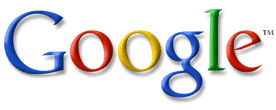
There are two reasons why the Google logo looks so simple: First,
it is based on an earlier sketch Brin designed using the free design
program GIMP; second, was the designer's decision to create something
simple, catchy and user-friendly.
While first sight the logo seems basic, as if it were never really
"designed," Kedar says that it went through many changes along the way.
"Someone who sees the logo for the first time doesn't necessarily
need to absorb all the layers and considerations behind every decision
- it's better for him to discover something new every time," she said.
Page and Brin, Kedar says, knew from the beginning of the process
what they needed. They did want to be perceived as part of the
establishment, as something heavy and cumbersome - they wanted to break
conventions and create something completely new. This, Kedar says, is
another reason the logo comprises only letters and no symbols.
"From the outset, it was clear to us that the name of company had
to stand at the center of the logo," she said. "It must be remembered
that at the time, many people were afraid to use the Internet, and it
was important to broadcast something user-friendly both on the home
page and in the logo. Something simple, that you didn't need to be
scared of, something catchy and full of life."
The use of primary colors - blue, yellow and red - was born of the
same desire, to design something that at first sight wouldn't be
threatening.
"With green there is something that stands on its own, that's not
apologizing," she said, "and also the two Os that lean slightly to
their sides. This gives a little drive to the logo, but also shows that
nothing on this site is standard."
Kedar demonstrated, using some of the earlier sketches, the quest to represent the infinite search.
In one old sketch, an 'O' is transformed into a magnifying glass,
an attempt to show that search results bring the seeker closer to his
goal.
Another sketch has the 'O's at the center of a target to portray
accuracy, and to emphasize that the result of a search is important.
Kedar even used capital letters in one design, in contrast to the
final result in which only the G appears in capitals. This was intended
to instill a feeling that the company is solid and serious, while
attempting to protect the feeling of playfulness that comes from every
letter being a different color.
In yet another sketch, Kedar turned one of the Os into a face and
added a smile, in an attempt to portray a positive search experience.
Kedar says that when she first brought the sketches to Page and
Brin, they would look at the pages, place them on the table, and
discuss with their visions for the company.
"It was important for them to tell me about themselves, what they
believe in, where they see themselves in the future and which people
they were looking for to work with them, even at a time when the entire
company numbered five people," she said.
"In general, when people speak about their big dreams in life, they
apologize many times for it, for the pretension. They [Brin and Page]
weren't like that. It was clear to them from the start that they had
something big in their hands."
Kedar is no longer perturbed by the criticism that any child could draw the Google logo.
"Ultimately, the question was whether to portray a feeling of
playfulness without using a familiar symbol that would limit us in its
meaning, something that is possible to appreciate in retrospect," she
said.
"We worked very hard in order to create something simple, and
that's also the reason all the other sketches were cancelled out on the
way. Or that they were sophisticated, or that they were too sharp. We
didn't want Google to be restricted to something, just like the search
is also not restricted."
Ten years later, the logo Kedar designed still continues to touch and surprise her.
"It somewhat amuses me to turn on the computer and look at the logo
I designed. But it also fills me with pride," she said. "When you say
Google to people today, they immediately see the colorful logo."
"Also, 'Google doodles' - the illustrations of Dennis Hwang that
accompany the logo in special events - don't disturb the design. On the
contrary, they awaken the strength of the product and play with the
logo in an exciting and very nice way," she said.
"From my point of view, that is a big achievement," she said. "I get a lot of pleasure from this child.
Article Link (Haaretz)
No comments:
Post a Comment